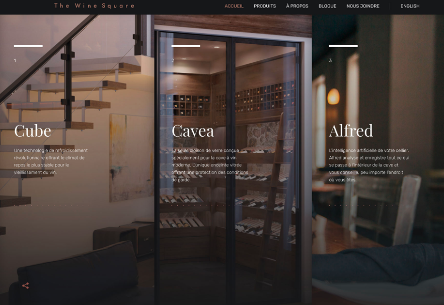
It’s true. Even in the digital world, old thing become new again. While scrunchies are taking over offline, three columns of text are back in fashion online. And it still works.
Here’s a direct extra from a Web Design depot article I’ve just read on web design trends this July 2018:
One … two … three! Three columns of text! While multi-column text blocks phased out some time ago, that trend seems to be circle back. More designs are featuring three columns of text. (Maybe because users have wider desktop screens? Three columns is a little less unwieldy to read.)
There’s a lot of science to back up the idea that elements in threes have a natural and harmonious feel to them.
The “rule of three” has long been associated with content creation and speechwriting as a way to bring home a set of points. Think of all the stories that feature threes – Three Little Pigs, The Three Musketeers, Three Stooges – and in literature plays use three acts. It’s also a common practice to use three bullets points to support facts in slides and presentations.
The rule of thirds helps you understand how and where users look at visual elements and even helps photographers and illustrators compose their work. So, it seems like a natural way to organize visual content as well….
The prettiest example?
#trending #webdesigntrends #gottakeepup
EP.


