Dementia Training Australia, University of Wollongong
Project: dta.com.au – New website
Launched: June 2020
- Lead Designer
- User Experience design
- User Interface design
- Landing page development
- Template design and development
- WordPress & Gutenberg editor
- Bootstrap, HTML, CSS
- Custom Icons
- Responsive web design
Case Study: How I contributed to an improved user experience of the DTA website
The client
DTA is funded by the Australian Government to provide dementia training and education to the Australian workforce.
The problem
Many users felt overwhelm on their first visit to the DTA website. They weren’t sure where to start. The use use of acronyms was confusing and intimidating, and the home page lacked a clear direction/pathway for users to follow.
User personas
I researched who our core website users were and determined that we have 2 key user types:
1) Individuals working with people living with dementia looking to up-skill and self educate. Individuals have varying levels of education – from highly skills doctors and practitioners to support workers where english is a second language (ESL)
2) Organisations looking to improve the care of people with dementia living at their organisation, by improving staff knowledge and changing their practice methods
I created short/brief personas for both user types and used this information in my presentation to stakeholders.
Research/findings
I viewed home page analytics (google analytics) for drop off rates and to evaluate the flow users took from our home page. I also listened to user feedback submitted via our help/support ticketing system and had conversations with our customer service team around experience and their opinions on where improvements could be made,
I found that many users felt overwhelm on their first website visit. They weren’t sure where to start. I also found that our use of acronyms was intimidating, and the home page lacked a clear direction/pathway for key users to follow.
Tools used
As the lead designer and change initiator, I used Photoshop and Illustrator to create a reworked home page design concept. I presented this concept to key stakeholders and part of the leadership team along with explanation around my design choices and rework decisions.
Outcome
1. A redesigned home page featuring:
- A clear call to action/pathway for key user types, above the fold (desktop and mobile).
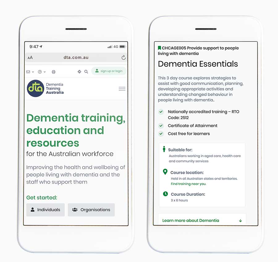
- Call to action buttons directing key user types to a landing page containing information relevant to them. For example, Individual leaners are directed to information, courses and resources relevant to individuals. They can then choose (optional) to filter this information by topic of interest etc.
- A positioning statement (above the fold) to reassure users they are in the right place
- Removed the use of acronyms in the navigation and header areas
- Replaced with explanations of acronym based services further down the home page
2. A decrease in support tickets from individuals confused about where to start. For example, Many support requests were initiated by individuals who were new to dementia and unsure what course to complete first. Our ‘Dementia Discovery’ is the perfect place for them, and is highlighted on the individual learner landing page. This page is now one of our most popular/visited pages.
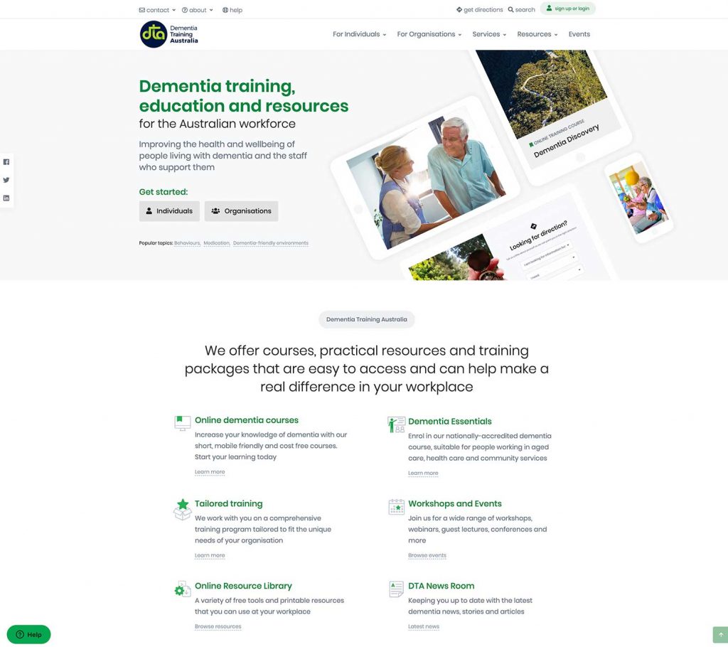
Reworked home page concept – 2 call to action buttons below a clear positioning statement 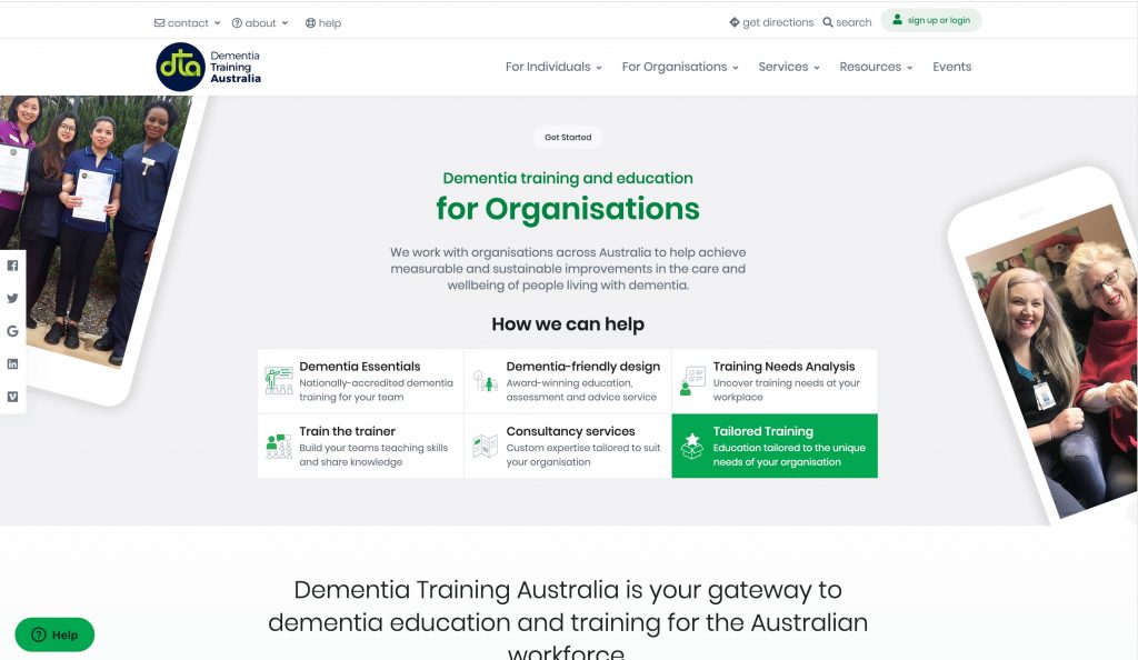
A new landing page for key user type, Organisations which highlights our most popular organisation offering, Tailored Training 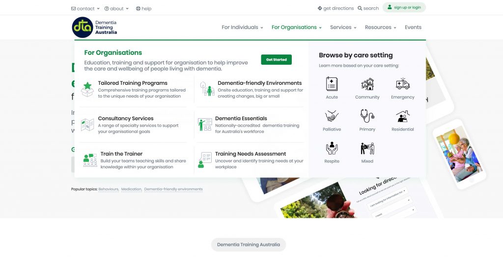
New sub navigation with custom iconography and setting type to offer faster access to relevant material 
Search Engine Optimisation
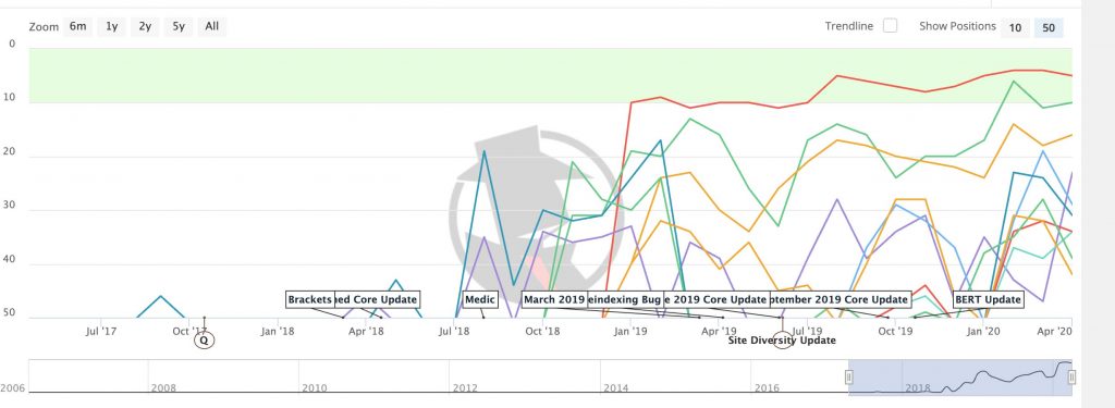
Ranking improvements
#1 google ranking and page 1 results
- Red line indicates vast improvement of keyword ‘online dementia courses’, a core business service
- Yellow line keyword: dementia australia
- Optimisation work started September 2018
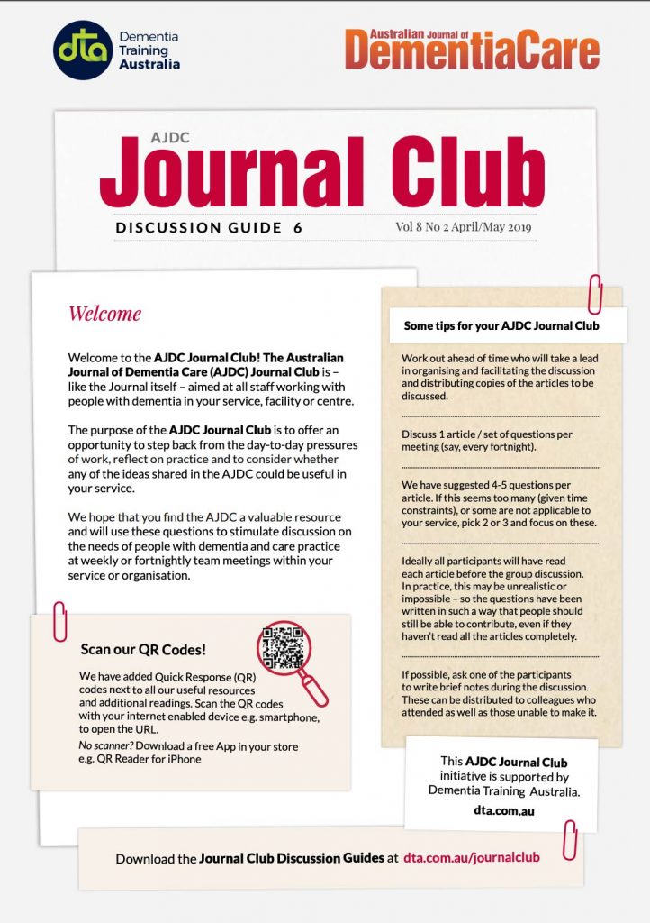
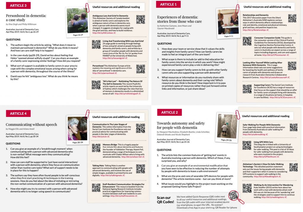
Project: Australian Journal of Dementia Care
Discussion Guide
- Concept development
- Design and Layout
- Develop template
- Print ready